roarkemoody
The Blue Level

The classic baseball logo has been a favorite of mine for years.

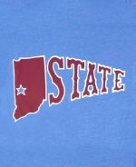
The warm-up logo from the early 70's is also an amazing touch to utilize where a full school name spell-out with using the state outline as the "I" of course would not fit as well.

Anything to phase out the new cartoon-ish silver outlined logo they released in 2019.
Roll Trees!


