George Mason is now the worst logo national champion!

WANTED: Passionate Sycamore Fanatics. That You?

Register NOW to join our community of die-hard Sycamore fans.

Jason Svoboda

The Bird Level
Administrator
Makes our rebrand look world class. This is just incredibly generic.



Become a Supporting Member to remove this ad and help support the site.
I don't particularly care for our new logo (seriously just use the baseball spiraled I/S for basketball too) but this is awful.

When I see "GM" I think of GM the appliance company, not George Mason.
 
state vintage.jpg

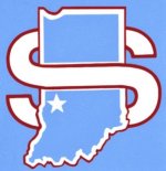
All they ever needed, IMHO. I'd rank the original "Sycamores" logo pretty high, too. But, I'd rank the current logo, which I'm not in love with well above the baseball "IS"...never a fan of that one at all. YMMV.
 
On a "semi" related note, I was reading a Q&A in an online magazine about the Indy Car mascot, Firestone's "Firehawk". A dude had previously decried how "stupid" it was and unnecessary. Another dude wrote in and mentioned that his youngster was fascinated by the Firehawk, and when he got the chance to meet the Firehawk, now the kid is obsessed with Indy Cars. That is who Sycamore Sam is for...my grandson saw him while I was watching a game this year and immediately became interested in the Sycamores. "Is there a game today"?...."can we go to a game"?...."Are we winning the game"?...every time he came over he wanted to know if the Sycamores were on...started with that blue, furry whatchamawhoozit.
 
View attachment 2907

All they ever needed, IMHO. I'd rank the original "Sycamores" logo pretty high, too. But, I'd rank the current logo, which I'm not in love with well above the baseball "IS"...never a fan of that one at all. YMMV.
Best logo in our arsenal. Not sure why they don't substitute the red with royal blue. Or make the state Royal Blue and the "S" outlined in powder blue. I think that would look pretty darn sharp.

But you are right the baseball interlocking "IS" is dreadful
 

Become a Supporting Member to remove this ad and help support the site.
I don't particularly care for our new logo (seriously just use the baseball spiraled I/S for basketball too) but this is awful.

When I see "GM" I think of GM the appliance company, not George Mason.

The interlocked I/S for baseball is quite possibly one of the WORST logos in the history of Indiana State, hell, the ~1982 era sycamore leaf used by the academic side for so many purposes looks better than the palsy-derived I/S.
 
View attachment 2907

All they ever needed, IMHO. I'd rank the original "Sycamores" logo pretty high, too. But, I'd rank the current logo, which I'm not in love with well above the baseball "IS"...never a fan of that one at all. YMMV.
This is the ultimate proof that our new logo sucks. It was so bad that everyone started looking for an older logo that actually looked good. The S logo is definitely the best ISU logo and I'm glad it has made a huge comeback. It might even be the most commonly worn logo at our basketball games now.
 
Back
Top